BTA 350 Analytics Project
Table of contents
- Project Section 1: Introduction
- Project Section 2: CONTEXT
- Project Section 3: Defining the problem
- Project Section 4: Data
- Project Section 5: Analysis
- Project Section 6: Evaluation
- Project Section 7: Interpretation
- Project Section 8: Recommendations
- Project Section 9: EXECUTIVE SUMMARY
- Project Section 10: Presentation
Data Dictionary
| Variable | Class | Description |
|---|---|---|
| track_id | character | Song unique ID |
| track_name | character | Song Name |
| track_artist | character | Song Artist |
| track_popularity | double | Song Popularity (0-100) where higher is better |
| track_album_id | character | Album unique ID |
| track_album_name | character | Song album name |
| track_album_release_date | character | Date when album released |
| playlist_name | character | Name of playlist |
| playlist_id | character | Playlist ID |
| playlist_genre | character | Playlist genre |
| playlist_subgenre | character | Playlist subgenre |
| danceability | double | Danceability describes how suitable a track is for dancing based on a combination of musical elements including tempo, rhythm stability, beat strength, and overall regularity. A value of 0.0 is least danceable and 1.0 is most danceable. |
| energy | double | Energy is a measure from 0.0 to 1.0 and represents a perceptual measure of intensity and activity. Typically, energetic tracks feel fast, loud, and noisy. For example, death metal has high energy, while a Bach prelude scores low on the scale. Perceptual features contributing to this attribute include dynamic range, perceived loudness, timbre, onset rate, and general entropy. |
| key | double | The estimated overall key of the track. Integers map to pitches using standard Pitch Class notation . E.g. 0 = C, 1 = C♯/D♭, 2 = D, and so on. If no key was detected, the value is -1. |
| loudness | double | The overall loudness of a track in decibels (dB). Loudness values are averaged across the entire track and are useful for comparing relative loudness of tracks. Loudness is the quality of a sound that is the primary psychological correlate of physical strength (amplitude). Values typical range between -60 and 0 db. |
| mode | double | Mode indicates the modality (major or minor) of a track, the type of scale from which its melodic content is derived. Major is represented by 1 and minor is 0. |
| speechiness | double | Speechiness detects the presence of spoken words in a track. The more exclusively speech-like the recording (e.g. talk show, audio book, poetry), the closer to 1.0 the attribute value. Values above 0.66 describe tracks that are probably made entirely of spoken words. Values between 0.33 and 0.66 describe tracks that may contain both music and speech, either in sections or layered, including such cases as rap music. Values below 0.33 most likely represent music and other non-speech-like tracks. |
| acousticness | double | A confidence measure from 0.0 to 1.0 of whether the track is acoustic. 1.0 represents high confidence the track is acoustic. |
| instrumentalness | double | Predicts whether a track contains no vocals. "Ooh" and "aah" sounds are treated as instrumental in this context. Rap or spoken word tracks are clearly "vocal". The closer the instrumentalness value is to 1.0, the greater likelihood the track contains no vocal content. Values above 0.5 are intended to represent instrumental tracks, but confidence is higher as the value approaches 1.0. |
| liveness | double | Detects the presence of an audience in the recording. Higher liveness values represent an increased probability that the track was performed live. A value above 0.8 provides strong likelihood that the track is live. |
| valence | double | A measure from 0.0 to 1.0 describing the musical positiveness conveyed by a track. Tracks with high valence sound more positive (e.g. happy, cheerful, euphoric), while tracks with low valence sound more negative (e.g. sad, depressed, angry). |
| tempo | double | The overall estimated tempo of a track in beats per minute (BPM). In musical terminology, tempo is the speed or pace of a given piece and derives directly from the average beat duration. |
| duration_ms | double | Duration of song in milliseconds |
Project Section 1: Introduction
DATASET: 30000 SPOTIFY SONGS(Arvidsson, n.d.)

SCHEDULED PLAN

Week 1 (4/07/24):
-Define the business question
-find suitable data
-complete part 1

Week 2 (4/14/24):
-ask business question
-Find data
-exploratory data analysis
-find trends and patterns
-complete part 2

Week 3 (4/21/24):
-data cleaning

Week 4 (4/28/24):
-Analysis

Week 5 (5/05/24):
-More analysis

Week 6 (5/12/24):
-PowerBI
-insert data into power BI

Week 7 (5/17/24):
Interpretation

Week 8 (5/22/24):
Recommendations

Week 9 (5/29/24):
Executive summary

Week 10 (6/9/24):
Presentation
Project Section 2: CONTEXT
The data is called “30000 Spotify Songs” on Kaggle. It was uploaded by Joakim Arvidsson, a Grand Master on Kaggle. The data comes from Spotify via the spotifyr package. It is a package that pulls data from spotifiy’s API (R Wrapper for the “Spotify” Web API, n.d.). The data has several variables such as: track_id, track_name, track_artist, track_popularity, and track_album_id.
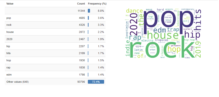
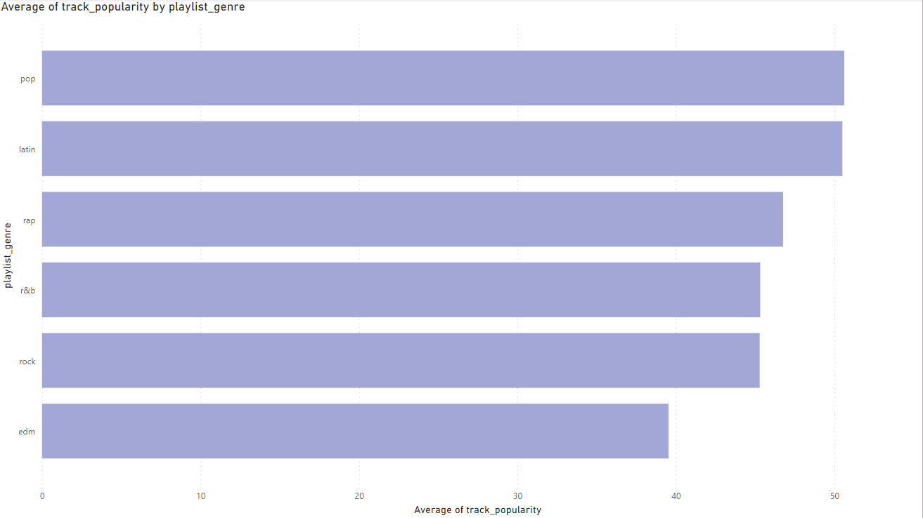
Looking at if the data is a good sample I decided to measure the playlist genre:
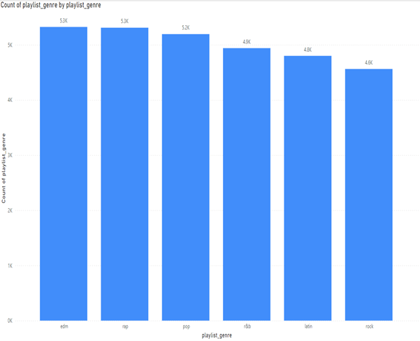
Here we can see that the data is right skewed, but the genres are not too far off from each other for an analysis. The difference between edm and rock is 762. Ideally, we would have an even number of all songs. This spread could point to what songs are more popular on Spotify. The data is from Spotify. Spotify is a digital music streaming platform that offers millions of songs, podcasts, and other audio content. Spotify is offered across various platforms such as IOS and Android.
My approach to the data has several components. The big question is, “How can we get consumers to listen to more songs?” According to Investopedia, 95% of Spotify’s revenue comes from premium subscriptions (Johnston, 2023). A big part of why people pay for Spotify is for the ad-free experience, unlimited skips, personalized playlists, etc (Spotify Editorial Team, 2023). Given this research we know that the more that we can get people to listen to music on the platform, the more likely they are to 1.) listen to music with ad-support or 2.) pay for a premium account.
The structured approach I will be taking for my analysis is:

1.)	defining the problem.
This is the guiding question for our analysis. What is the problem we are trying to solve and answer?

2.)	Getting the right data.
Is the data suitable for the analysis?

3.)	Analysing the data.
This involves using several methods of analysis like regression analysis, cluster analysis, and hypothesis testing.

4.)	Evaluating the results.
This step includes the following. Did we do the analysis correctly? Were there errors? Is our data significant? Were our models complex enough to answer our problem?

5.)	Interpreting the results.
This step includes the following. What do the results tell us? What is the relationship between the chosen variables? How strong was the relationship between the variables? How certain are we that the results are correct?

6.)	Communicating the results.
This step involves communicating the findings to stakeholders. What they mean and how to interpret them.

 7.) Decide.

This step is what actions the business can take in order solve the business problem at hand and support business decisions.
Project Section 3: Defining the problem
The problem definition is “How can Spotify improve the profit margins of their core business which is their digital music streaming services? My business question definition is “How can we get consumers to listen to more songs and longer?” The problem's relevance is that Spotify has never been profitable for an entire fiscal year in its history. A company can only remain unprofitable for so long. It is crucial that Spotify find a path toward profitability. Analyzing Spotify’s user data is crucial as users are the main source of revenue for Spotify. By improving customer experience and retention, Spotify can improve its profit margins. Prioritizing data-driven insights will create a pathway toward sustainable profitability within its core music streaming business.
The profitability challenge is not merely a financial problem; it is integral to Spotify's ability to innovate, invest in content acquisition, and expand its market share against competitors. Moreover, as the digital streaming landscape evolves with new entrants and changing consumer preferences, Spotify must adapt to remain relevant. Analyzing user data isn't just about understanding current behaviors; it is about anticipating future trends and evolving alongside user demands. By prioritizing data-driven insights and refining its platform to better serve user needs, Spotify can secure its position as a market leader and pave the way for sustainable profitability in an ever-changing digital music landscape.
Project Section 4: Data
Libraries used:
import numpy as np
import pandas as pd
import seaborn as sns
import matplotlib.pyplot as plt
from ydata_profiling import ProfileReport
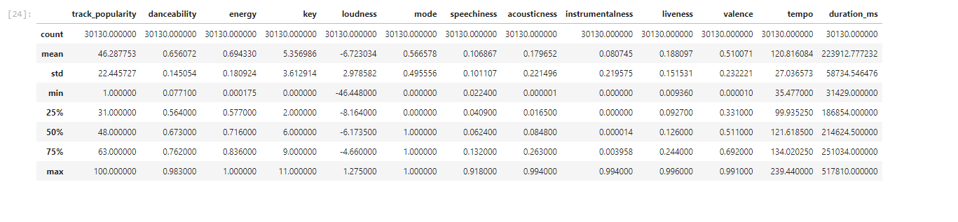
from collections import CounterMy dataset 30000 spotify songs” has over 30000 entries of data most of the data types are either float or object values. Most of the data is qualitative such as track name, track artists, etc. There are some quantitative variable such as duration, tempo, and liveliness.
    df.info()

    Index: 30130 entries, 0 to 32832
    Data columns (total 23 columns):
     #   Column                    Non-Null Count  Dtype
    ---  ------                    --------------  -----
     0   track_id                  30130 non-null  object
     1   track_name                30130 non-null  object
     2   track_artist              30130 non-null  object
     3   track_popularity          30130 non-null  int64
     4   track_album_id            30130 non-null  object
     5   track_album_name          30130 non-null  object
     6   track_album_release_date  30130 non-null  object
     7   playlist_name             30130 non-null  object
     8   playlist_id               30130 non-null  object
     9   playlist_genre            30130 non-null  object
     10  playlist_subgenre         30130 non-null  object
     11  danceability              30130 non-null  float64
     12  energy                    30130 non-null  float64
     13  key                       30130 non-null  int64
     14  loudness                  30130 non-null  float64
     15  mode                      30130 non-null  int64
     16  speechiness               30130 non-null  float64
     17  acousticness              30130 non-null  float64
     18  instrumentalness          30130 non-null  float64
     19  liveness                  30130 non-null  float64
     20  valence                   30130 non-null  float64
     21  tempo                     30130 non-null  float64
     22  duration_ms               30130 non-null  int64
    dtypes: float64(9), int64(4), object(10)
    memory usage: 5.5+ MB
I looked at several things for my exploratory data analysis. I first created a heatmap to find some correlations.
selected_columns = ['track_popularity',
                    'danceability',
                    'energy',
                    'loudness',
                    'speechiness',
                    'acousticness',
                    'instrumentalness',
                    'liveness',
                    'valence',
                    'tempo',
                    'duration_ms'
                   ]

df_set = df[selected_columns]

plt.figure(figsize=(16, 8))
sns.set(style="whitegrid")
sns.heatmap(df_set.corr(),annot=True, cmap='YlGnBu')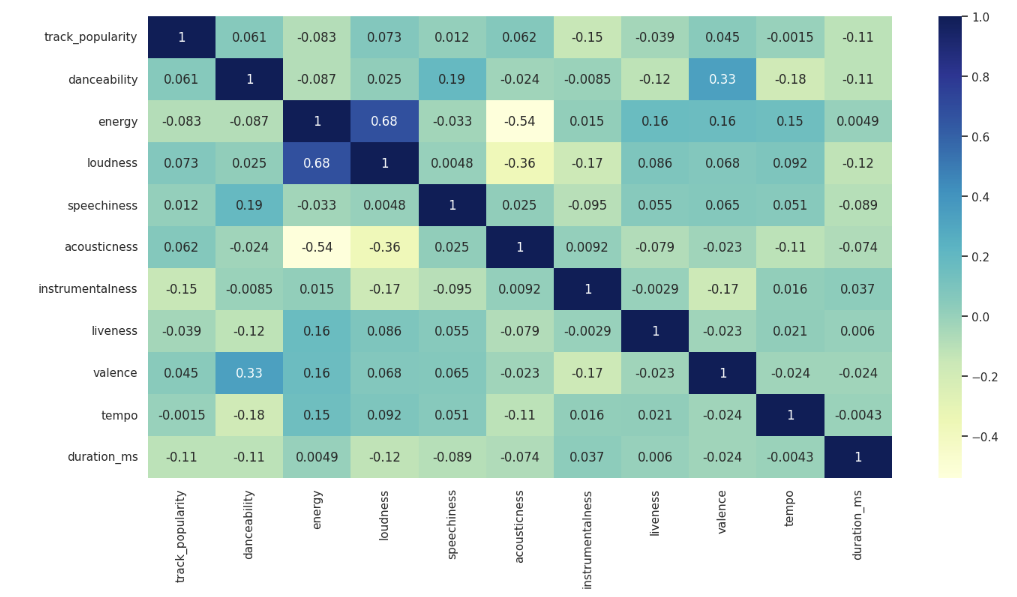
I then looked for relationships for my qualitative variables like track_artists and track_name. I also looked at correlations for others variableslike genre and track popularity, but there was not much correlation. I also looked at the summary statistics. Analyzing the summary statistics did not offer any noticeable patterns given the nature of my data.
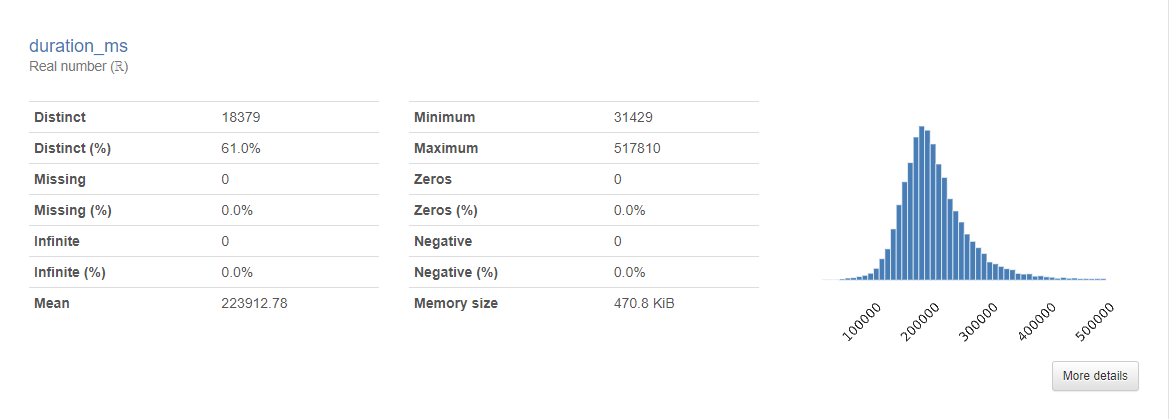
This data set is right for my business question. The data is derived directly from Spotify’s own API and the user that uploaded the data is a highly regarded member of the Kaggle community. With over 30,000 songs, this is a big enough data set to analyze and draw some analysis. I also looked at duration_ms to see if there was any correlation with track duration and popularity. Looking at the heatmap there was little to no correlation. What was interesting to me however was that the histogram for the data was right skewed. Further analysis demonstrated to me however that this was not meaningful since I had already determined there was little to no correlation between song duration and popularity.
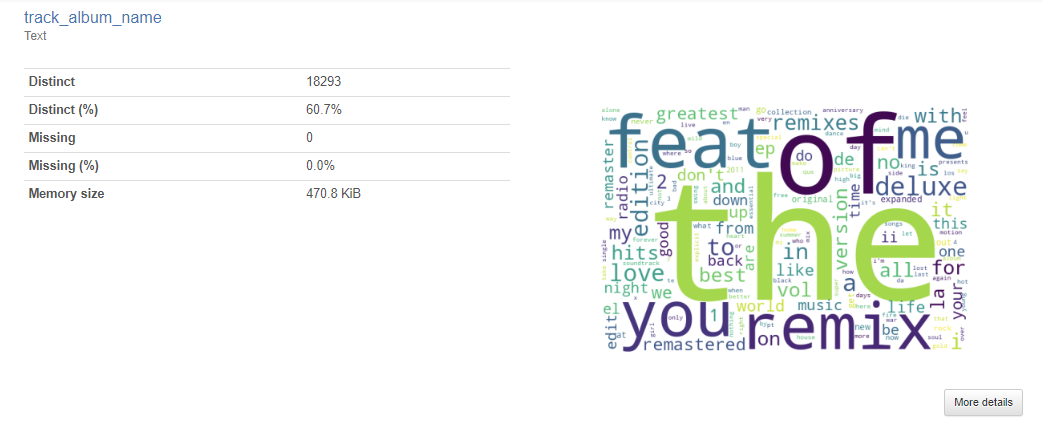
Another thing I decided to explore was the frequency of certain words. Words in tracks, genres, artists, album id, playlist_name, and album names. I did not find it particularly insightful. Most of the high frequency words were words like “the”, “you”, “me”, etc. Playlist name however did yield some insight which led to exploring the relationship more in PowerBI.
Here is the chart I analyzed in PowerBI when it comes to track popularity by playlist name.
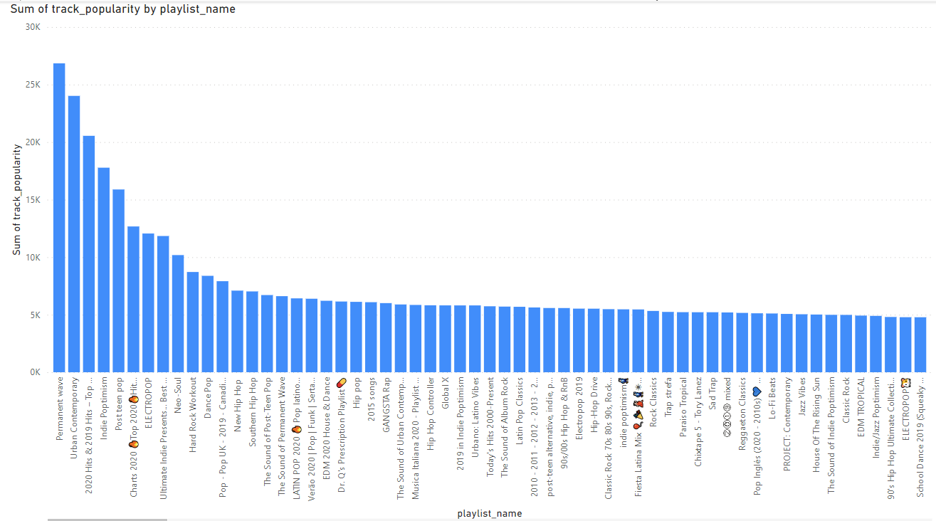
Looking at the 5 top, Perment wave is a type of rock music (Permanent Wave Artists, Songs, Albums, Playlists and Listeners – Volt.fm, n.d.). Urban contemporary is a type of hop. 2020 Hits and 2019 Hits are just the most popular songs of this data set’s latest years which were 2019 and 2020. Indie Poptimism is a type of pop music. Lastly is Post teen pop which is another type of pop music (Post-Teen Pop Artists, Songs, Albums, Playlists and Listeners – Volt.fm, n.d.). Here we see that pop music is very popular which is not as insight as I had hoped. Pop music being one of the most popular genres is not a new insight (Richter, 2018).
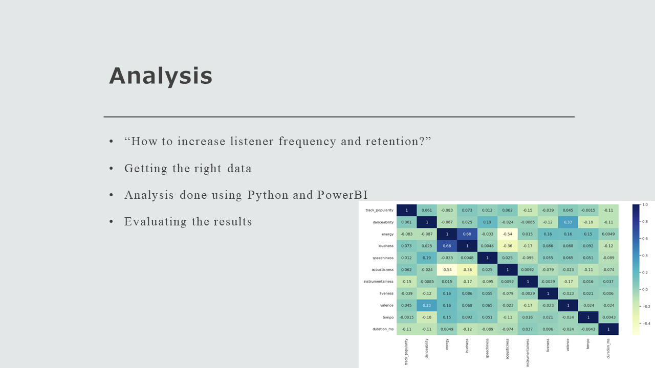
Project Section 5: Analysis
The outcome variable for my analysis is track_popularity. For my analysis I decided to look at what variables could affect track popularity. I conducted most of my analysis using Python. I used several libraries:
import numpy as np
import pandas as pd
import seaborn as sns
import matplotlib.pyplot as plt
from ydata_profiling import ProfileReport
from collections import Counter
I cleaned the data using:
df.isnull().sum()This drops all null values from the data.
I then dropped all the zeros from track_popularity as I found it was skewing my data.df = df[df['track_popularity'] != 0] .df.to_csv('cleanedspotify.csv') For the first portion of my analysis, I first created a heatmap of the data to figure out which variables may be useful to look at that could be useful in answering the business question:
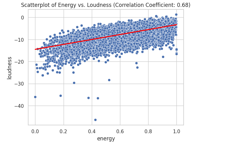
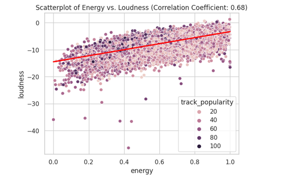
Looking the the heatmap I saw that energy and loudness have some correlation. I also saw dancebility and valence, and accousticness and energy. I created several scatterplots to look for correlations in my data.
correlation_coefficient = df_set['energy'].corr(df_set['loudness'])
    sns.scatterplot(data= df_set, x= 'energy', y='loudness', hue='track_popularity')
    sns.regplot(data=df_set, x='energy', y='loudness', scatter=False, color='red')
    plt.title(f'Scatterplot of Energy vs. Loudness (Correlation Coefficient: {correlation_coefficient:.2f})')
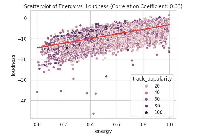
A correlation of 0.68 is considered a strong positive correlation. We can also visually see this as most of the data is near each other in a linear line indicating that there is a positive correlation.
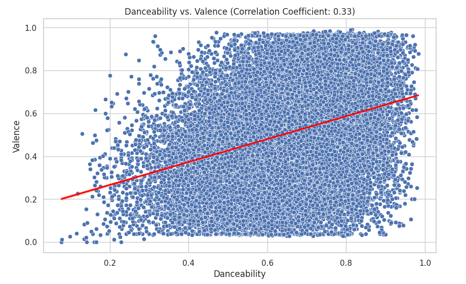
I then looked at danceability and valence:
correlation_coefficient = df_set['danceability'].corr(df_set['valence'])

plt.figure(figsize=(10, 6))
sns.scatterplot(data=df_set, x='danceability', y='valence', hue='track_popularity')
sns.regplot(data=df_set, x='danceability', y='valence', scatter=False, color='red')
plt.title(f'Danceability vs. Valence (Correlation Coefficient: {correlation_coefficient:.2f})')
plt.xlabel('Danceability')
plt.ylabel('Valence')
plt.show()
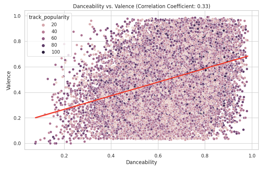
I looked at the danceability vs valance since with a correlation of 0.33 there could be some sort of connection. I also layered the data points with their track popularity to see if there was an additional connection. Here we can see that there is little to no correlation between danceability and valence. This is because the data is scattered far apart from each other.
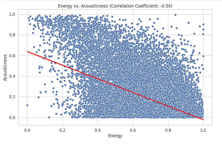
The variables that I decided to look at next were energy and acousticness:
correlation_coefficient = df_set['energy'].corr(df_set['acousticness'])

plt.figure(figsize=(10, 6))
sns.scatterplot(data=df_set, x='energy', y='acousticness', hue='track_popularity')
sns.regplot(data=df_set, x='energy', y='acousticness', scatter=False, color='red')
plt.title(f'Energy vs. Acousticness (Correlation Coefficient: {correlation_coefficient:.2f})')
plt.xlabel('Energy')
plt.ylabel('Acousticness')
plt.show()
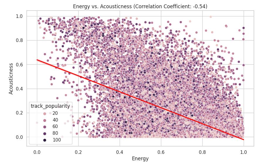
The data have as correlation of -0.54 which means that there is little to no correlation. We can visually see this as the data points are scattered everywhere.
Looking at the correlations in the heatmap did not give me a clear view of the data. Quantitative analysis did not yield as much insight as I thought it would. I decided to analyze the qualitative data. This led to me to create a chart for track_name and popularity:
plt.figure(figsize=(40, 30))
sns.set(style="whitegrid")

x = df.groupby("track_name")["track_popularity"].mean().sort_values(ascending=False).head(10)
axis = sns.barplot(x=x.index, y=x)

axis.set_ylabel('Popularity', fontsize=40)
axis.set_xlabel('song title', fontsize=40)
axis.tick_params(labelsize=20) 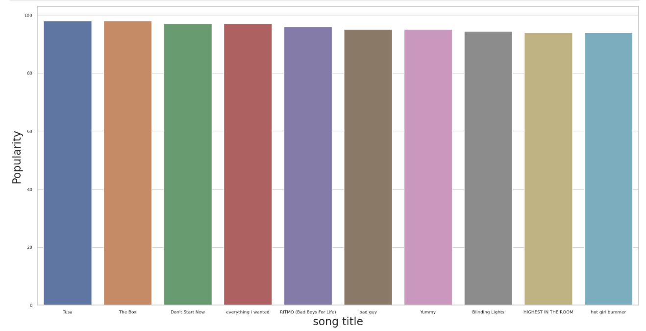
I then created a bar chart for track_artist and track_popularity:
from collections import Counter
artist_popularity_sum = Counter()
for l in df[["track_artist", "track_popularity"]].to_numpy():
artist_list = [x.strip() for x in l[0].split(',')]
for artist in artist_list:
artist_popularity_sum[artist] += float(l[1])
#split separates artists names
#strip gets rid of spaces
#popularity add points to an artist
top_10_artist = artist_popularity_sum.most_common(10)
xs = [a[0] for a in top_10_artist]
ys = [a[1] for a in top_10_artist]
plt.figure(figsize=(20, 10))
sns.set(style="whitegrid")
axis = sns.barplot(x=xs, y=ys)
axis.set_ylabel('Popularity')
axis.set_xlabel('artist')
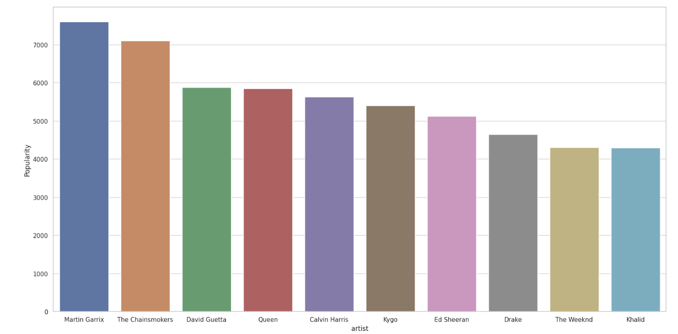
I then looked at genre and sum genre in PowerBI.
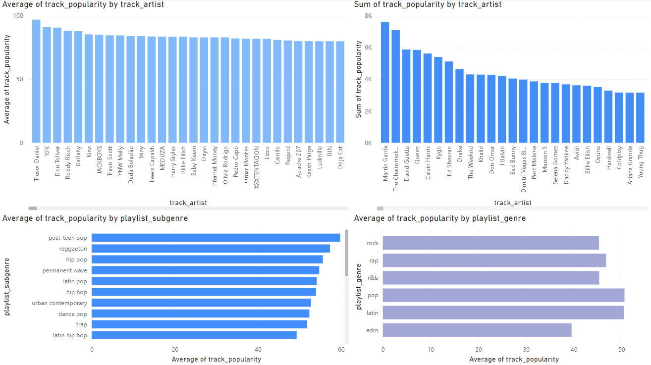
I first looked at the averages of track_artists and playlist_genre and their popularity score(0-100). This gave me insight into which artists had the highest ratings, but this did not give me a full picture of the data as this only tells me their ratings on average not how popular they are. If an artist has 1 song with a rating of 100 but the song has only been listened to 10 times is that actually a popular song? This made me look toward using sum to get a better estimate of an artist’s popularity and genre popularity. The sum gives a much better picture toward a genre’s overall popularity and an Artist’s overall popularity.
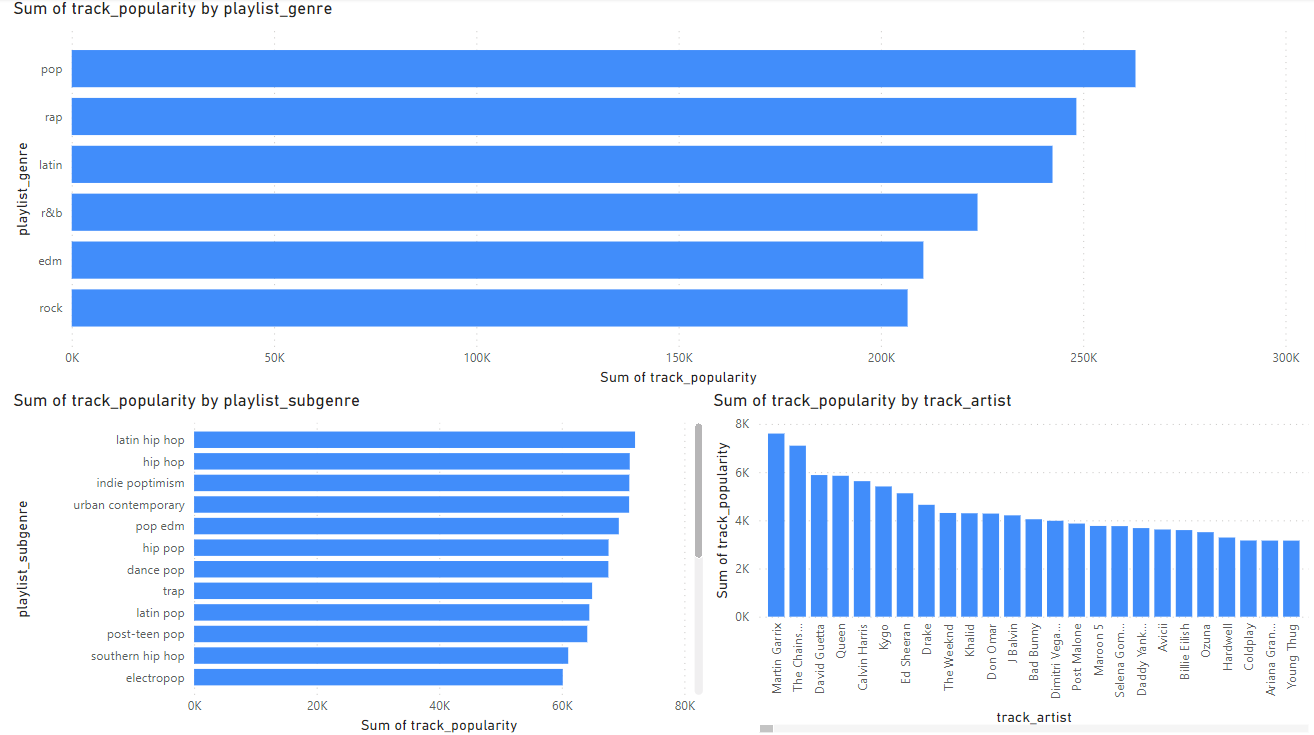 The sum gives a much better picture toward a genre’s overall popularity and an Artist’s overall popularity.
Project Section 6: Evaluation
There was five main relationships that I explored in my data these were:
1.) Energy and loudness
2.) Danceability vs. Valence
3.) Energy and Acousticness
4.) Song title and Popularity
5.) Popularity and Artist
The first method that will be used to validate the results is looking at the confounding variables.
One confounding variable is the algorithms Spotify uses to label what music has energy. There is no exact documentation on how Spotify’s algorithms label and classify songs with their chosen metrics. This gives us an unclear picture on how exactly the data was labelled (Spotify, n.d.).
Another confounding variable could possibly be listener preferences.

The data is from 1981-2020. The data could be getting skewed by certain years or eras of music. Certain genres were more popular during certain years. For example in the 1990s Alternative Rock was very popular (Yellowbrick, 2023). In 2020 genres like Hip-hop and EDM were very popular.
The next method that will be used is to check for overfitting. I will be using machine learning in python to check for overfitting for the three relationships we explored for correlation:
1.)Energy vs. loudness 2.) Danceability vs. Valence 3.) Energy vs. Acousticness
The python libraries that were used:
from sklearn.model_selection import train_test_split
from sklearn.linear_model import LinearRegression
from sklearn.metrics import mean_squared_error, r2_score
The first section will be examining our chosen variables with track popularity. The second section will be examining the relationship between our chosen variables like Energy vs. Acousticness.
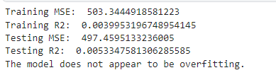
The first that will be checked for overfitting is Energy vs Loudness and track popularity:
# Split the data
X = df_set[['energy', 'loudness']]
y = df_set['track_popularity']
X_train, X_test, y_train, y_test = train_test_split(X, y, test_size=0.3, random_state=42)

# Train the model
model = LinearRegression()
model.fit(X_train, y_train)

# Evaluate on training data
y_train_pred = model.predict(X_train)
train_mse = mean_squared_error(y_train, y_train_pred)
train_r2 = r2_score(y_train, y_train_pred)

# Evaluate on testing data
y_test_pred = model.predict(X_test)
test_mse = mean_squared_error(y_test, y_test_pred)
test_r2 = r2_score(y_test, y_test_pred)

# Print results
print("Training MSE: ", train_mse)
print("Training R2: ", train_r2)

print("Testing MSE: ", test_mse)
print("Testing R2: ", test_r2)

# Check for overfitting
if train_r2 > test_r2:
    print("The model might be overfitting. Training R2 is higher than testing R2.")
else:
    print("The model does not appear to be overfitting.")
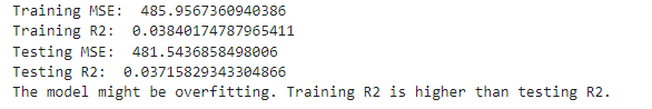
Here we see that that the training R squared is greater than the testing R squared. This indicates that the model could be overfitting. Which means that our models may only work with the data set we have and the results may not have the predictive power we think it has.
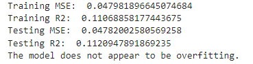
The second that will be checked for overfitting for is Danceability vs. Valence and track popularity:
# Split the data
X = df_set[['danceability', 'valence']]
y = df_set['track_popularity']
X_train, X_test, y_train, y_test = train_test_split(X, y, test_size=0.3, random_state=42)

# Train the model
model = LinearRegression()
model.fit(X_train, y_train)

# Evaluate on training data
y_train_pred = model.predict(X_train)
train_mse = mean_squared_error(y_train, y_train_pred)
train_r2 = r2_score(y_train, y_train_pred)

# Evaluate on testing data
y_test_pred = model.predict(X_test)
test_mse = mean_squared_error(y_test, y_test_pred)
test_r2 = r2_score(y_test, y_test_pred)

# Print results
print("Training MSE: ", train_mse)
print("Training R2: ", train_r2)

print("Testing MSE: ", test_mse)
print("Testing R2: ", test_r2)

# Check for overfitting
if train_r2 > test_r2:
    print("The model might be overfitting. Training R2 is higher than testing R2.")
else:
    print("The model does not appear to be overfitting.")
Here we see that that training R squared is less than the testing R squared. This indicates that the model is not overfitting. Which means that our models may have the predictive power that we think they do.
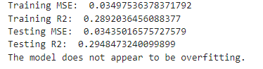
The third is Energy vs. Acousticness and track popularity:
# Split the data
X = df_set[['energy', 'acousticness']]
y = df_set['track_popularity']
X_train, X_test, y_train, y_test = train_test_split(X, y, test_size=0.3, random_state=42)

# Train the model
model = LinearRegression()
model.fit(X_train, y_train)

# Evaluate on training data
y_train_pred = model.predict(X_train)
train_mse = mean_squared_error(y_train, y_train_pred)
train_r2 = r2_score(y_train, y_train_pred)

# Evaluate on testing data
y_test_pred = model.predict(X_test)
test_mse = mean_squared_error(y_test, y_test_pred)
test_r2 = r2_score(y_test, y_test_pred)

# Print results
print("Training MSE: ", train_mse)
print("Training R2: ", train_r2)

print("Testing MSE: ", test_mse)
print("Testing R2: ", test_r2)

# Check for overfitting
if train_r2 > test_r2:
    print("The model might be overfitting. Training R2 is higher than testing R2.")
else:
    print("The model does not appear to be overfitting.")
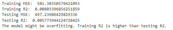
Here we see that that the training R squared is greater than the testing R squared. This indicates that the model could be overfitting. Which means that our models may only work with the data set we have and the results may not have the predictive power we think it has.
Given how low our R squares are for our data, this demonstrates that are chosen variables have very little predictive power for track popularity.
I will now examine the relationship between our chosen variables. The first relationship that will be examined will be Energy vs. Loudness.
# Split the data
X = df_set[['energy']]
y = df_set['loudness']
X_train, X_test, y_train, y_test = train_test_split(X, y, test_size=0.3, random_state=42)

# Train the model
model = LinearRegression()
model.fit(X_train, y_train)

# Evaluate on training data
y_train_pred = model.predict(X_train)
train_mse = mean_squared_error(y_train, y_train_pred)
train_r2 = r2_score(y_train, y_train_pred)

# Evaluate on testing data
y_test_pred = model.predict(X_test)
test_mse = mean_squared_error(y_test, y_test_pred)
test_r2 = r2_score(y_test, y_test_pred)

# Print results
print("Training MSE: ", train_mse)
print("Training R2: ", train_r2)

print("Testing MSE: ", test_mse)
print("Testing R2: ", test_r2)

# Check for overfitting
if train_r2 > test_r2:
    print("The model might be overfitting. Training R2 is higher than testing R2.")
else:
    print("The model does not appear to be overfitting.")
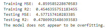
Here we see that there is no overfitting as the training R squared is smaller than the testing R squared. This means our models may have explanatory power outside our data set.
Next will be Danceability vs. Valence:
# Split the data
X = df_set[['danceability']]
y = df_set['valence']
X_train, X_test, y_train, y_test = train_test_split(X, y, test_size=0.3, random_state=42)

# Train the model
model = LinearRegression()
model.fit(X_train, y_train)

# Evaluate on training data
y_train_pred = model.predict(X_train)
train_mse = mean_squared_error(y_train, y_train_pred)
train_r2 = r2_score(y_train, y_train_pred)

# Evaluate on testing data
y_test_pred = model.predict(X_test)
test_mse = mean_squared_error(y_test, y_test_pred)
test_r2 = r2_score(y_test, y_test_pred)

# Print results
print("Training MSE: ", train_mse)
print("Training R2: ", train_r2)

print("Testing MSE: ", test_mse)
print("Testing R2: ", test_r2)

# Check for overfitting
if train_r2 > test_r2:
    print("The model might be overfitting. Training R2 is higher than testing R2.")
else:
    print("The model does not appear to be overfitting.")
Here we see that there is no overfitting as the training R squared is smaller than the testing R squared. This means our models may have explanatory power outside our data set.
The last relationship we will look at is Energy vs. Acousticness.
# Split the data
X = df_set[['energy']]
y = df_set['acousticness']
X_train, X_test, y_train, y_test = train_test_split(X, y, test_size=0.3, random_state=42)

# Train the model
model = LinearRegression()
model.fit(X_train, y_train)

# Evaluate on training data
y_train_pred = model.predict(X_train)
train_mse = mean_squared_error(y_train, y_train_pred)
train_r2 = r2_score(y_train, y_train_pred)

# Evaluate on testing data
y_test_pred = model.predict(X_test)
test_mse = mean_squared_error(y_test, y_test_pred)
test_r2 = r2_score(y_test, y_test_pred)

# Print results
print("Training MSE: ", train_mse)
print("Training R2: ", train_r2)

print("Testing MSE: ", test_mse)
print("Testing R2: ", test_r2)

# Check for overfitting
if train_r2 > test_r2:
    print("The model might be overfitting. Training R2 is higher than testing R2.")
else:
    print("The model does not appear to be overfitting.")
Here we see that there is no overfitting as the training R squared is smaller than the testing R squared. This means our models may have explanatory power outside our data set.
Given our results, I will say that my claims are limited to correlation. It is difficult to claim causation with the results we obtained from looking at correlation and the R squared values for our variables.
We will investigate significance using p value. This will be done in python with the following libraries:
import scipy.stats as stats
Our null hypothesis is that there is no relationship between energy and loudness. Our alternative hypothesis is that there is a relationship between energy and loudness. My chosen alpha level is 0.05.
Energy vs. Loudness
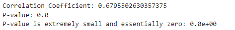
The p-value is practically 0 that means we can reject the null hypothesis and that the correlation is statistically significant.
Danceability vs. Valence:
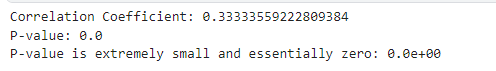
The p-value is practically 0 that means we can reject the null hypothesis and that the correlation is statistically significant.
Energy vs Acousticness:
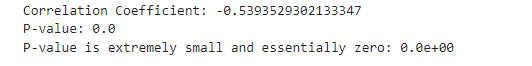
The p-value is practically 0 that means we can reject the null hypothesis and that the correlation is statistically significant.
Evaluating the p-values for the three scatterplots that I create leads me to believe that my findings do have business significance. This is because through out all the testing we have proven correlation with the chosen variables. Which can help and guide business decisions at Spotify.
Given that R squared values are one way of measuring effect size, we can say that there is in fact correlation with the variables examined. This makes it worth using for business decisions.
Given the testing and analysis I am satisfied with the results. I do not think that any further analysis is necessary for my data set.
Project Section 7: Interpretation
Model 1:
Directionality: The directionality of my data shows that there is a trend of energy and loudness being correlated with each other. This means sounds with more energy tend to be louder.
Magnitude: The strength of this relationship has a correlation coefficient of 0.68 demonstrating a positive relationship. The magnitude of this is that songs with more energy tend to be louder.
Uncertainty: We are certain these results are correct due to testing for R squared and the p-value.
Model 2:
Directionality: The trend in the data is that:
Tusa: pop

The box: hip hop/rap

Don’t start now: pop

Everything I wanted: pop

Ritmo(bad boys for life): Reggaeton
Bad guy: pop

Yummy: pop

Blinding lights: Synthwave, R&B/Soul, Alternative/Indie

Highest in the room: trap

Hot girl bummer: Alternative R&B, Alternative/Indie, Pop, Country
6/10 songs in the top 10 are pop songs. The trend is that pop songs is the most popular category of music.
Magnitude:

The magnitude of knowing that the 6/10 top songs are a part of the pop genre is that we can see that the pop genre could be a key genre to push forth in order to increase listener frequency.
This chart shows how pop is the number one genre in this data set. Supporting the observation above.
Uncertainty: We can not be completely certain that the data will extrapolate. Some years, months or weeks certain genres will be more popular. We can say however that on average, pop songs tend to be the most popular. Given that the data is from 1981-2020 and we have over 30,000 data points, we can be fairly certain of our analysis of pop songs being the most popular on average.
The final model that represents my findings well is Model 2:
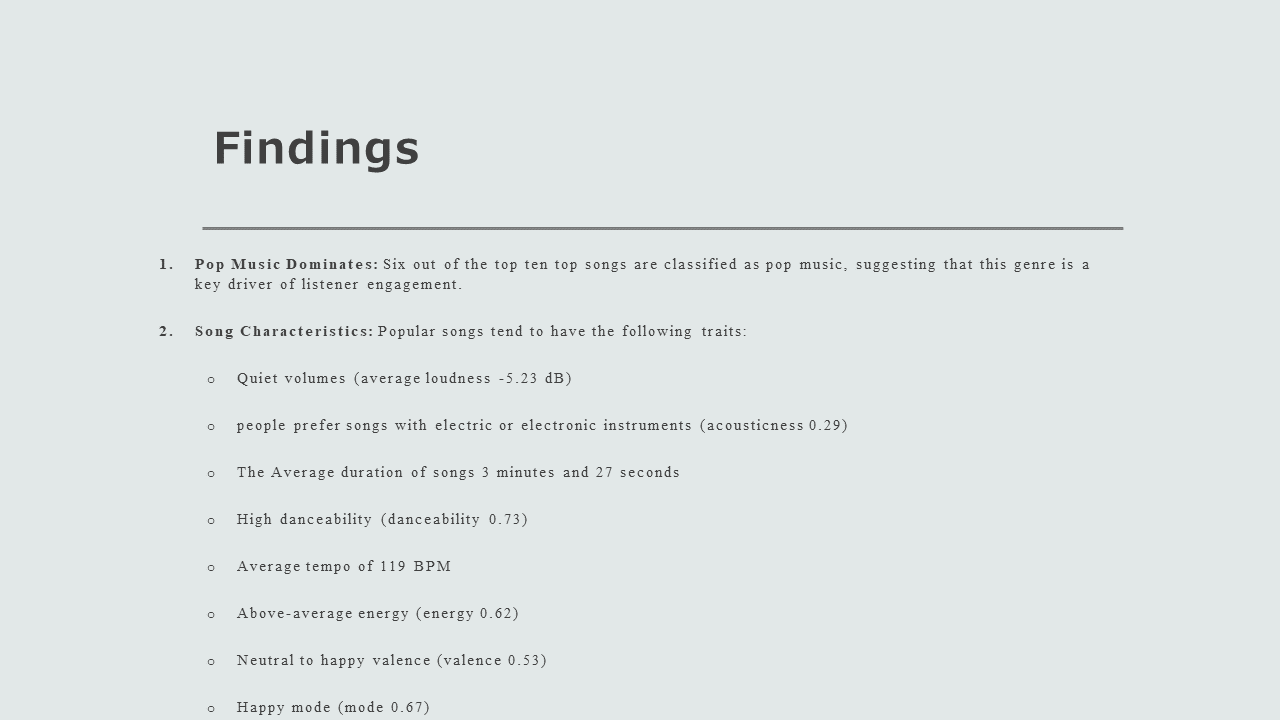
Traits:
Mean: 98.19

Median: 98

6/10 of the top 10 songs are pop songs

Patterns:
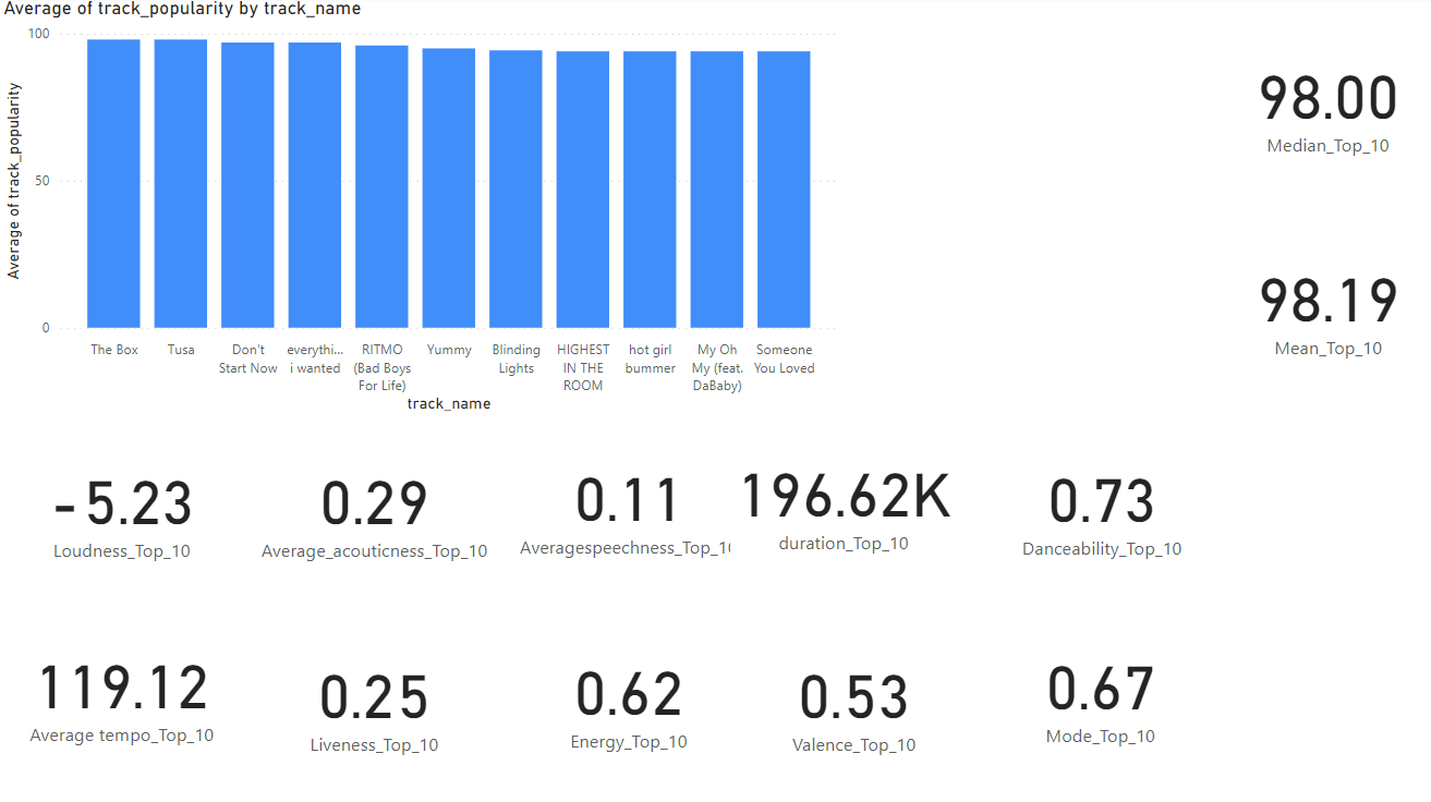
Using PowerBI, I calculated the averages of the traits of the top 10 songs.
Loudness: -5.23 dB would mean that people like songs that are close to reference point defined by Spotify. This would mean that people enjoy music slightly quieter than Spotify’s defined loudness.
Acousticness: An acouticness of 0.29 indicates that people prefer songs with electric or electronic instruments rather than songs with acoustic instruments like the piano or string instruments.
Speechness: A value of 0.11 tells us that the audio in question is mostly likely music. “Values below 0.33 most likely represent music and other non-speech-like tracks”.
Duration: A duration of 196.62k milliseconds is 3.277 minutes. This suggests that songs around the 3 minute mark are more popular than longer songs. This has been studied and confirmed (Chen, 2024).
Danceability: A danceability of 0.73 suggests that popular songs have a high danceability. “value of 0.0 is least danceable and 1.0 is most danceable.”
Tempo: A temp of 119.12 suggests that average tempo is a key characteristic of popular songs. This article suggest that popular songs are around 100-140 BPM (Master Class, 2021).
Liveness: Liveness is a measure of if a song was performed live. A liveness of 0.8 would suggest that a song was performed live. A liveness of 0.25 suggests that listeners prefer songs that are recorded.
Energy: An energy of 0.62 suggests that listeners prefer songs that have an above amount of energy. This suggests that Spotify should push songs that have above average energy to retain listeners for longer.
Valence: An valence of 0.53 suggests that people prefer a more neutral valence. This means neither sad or happy music.
Mode: A mode of 0.67 suggests that listeners prefer songs that are happier and more energetic. Major mode is represented by 1. Minor Mode (which is represented by 0) is sad or serious.
Outliers:
There are no outliers in the model.
Assessing the findings against the original problem, question, and the dataset, the analysis found several observations. The first is that popular songs have certain characteristics that increase listener retention and frequency. The original question for the dataset was “What are the characteristics found in songs that attract sustained and frequent listenership?”. The findings answer the problem the analysis was trying to figure out.
Project Section 8: Recommendations
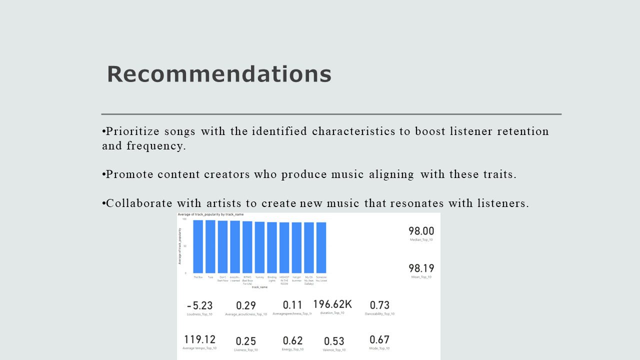
These are my recommendations after doing a thorough analysis of the data set in order to answer the business question, “What are the characteristics found in songs that attract sustained and frequent listenership?”. The set of recommendations I recommend to the board is to push out songs that have the characteristics of the top 10 songs in the data set that were analysed.
The analysis revealed the top 10 songs had traits that could improve listener retention and listener listening frequency. People enjoyed music slightly quieter than Spotify’s defined loudness. People prefer songs with electric or electronic instruments rather than songs with acoustic instruments like the piano or string instruments. People prefer music that are around 3 minutes long. People prefer music with high danceability. People prefer music with an average tempo of 119. People prefer music with above average energy. People prefer neutral music neither sad nor happy. The mode however has a high average suggesting that people prefer happy music. My deduction from my analysis for the mode is that people prefer music that is neutral to happy.
The use of consumer data raises ethical concerns. It is essential that the data used for the analysis complies with privacy laws and ethical guidelines. Whether this be in future analysis or the data is stored for example. The company should take steps to improve transparency and inform users about the use of their data and give them the ability to access their data.
Project Section 9: EXECUTIVE SUMMARY
Executive Summary:
As part of the ongoing efforts to better understand what drives listener retention and frequency, we analyzed a dataset of 30,000 songs from Spotify that covers the past four decades. The analysis revealed several key characteristics that are common among popular songs.
Key Findings:
    1.	Pop Music Dominates: Six out of the top ten top songs are classified as pop music, suggesting that this genre is a key driver of listener engagement.
    2.	Song Characteristics: Popular songs tend to have the following traits:
        o	Quiet volumes (average loudness -5.23 dB)
        o	Electric/electronic instrumentation (acousticness 0.29)
        o	Average duration of 3 minutes and 27 seconds
        o	High danceability (danceability 0.73)
        o	Average tempo of 119 BPM
        o	Above-average energy (energy 0.62)
        o	Neutral to happy valence (valence 0.53)
        o	Happy mode (mode 0.67)
Recommendation:
Based on the analysis, we recommend that Spotify prioritize songs with these characteristics to increase listener retention and frequency. This could involve promoting content creators who produce music that aligns with these traits or collaborating with artists to create new music that resonates with listeners.
Graphical Representation:
Project Section 10: Presentation